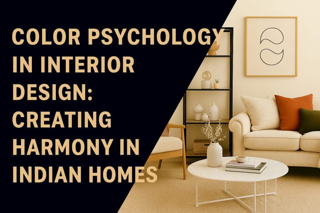
Color Psychology in Interior Design: Creating Harmony in Indian Homes
Colors have an unmatched ability to affect our mood, activities, and well-being. The colors surrounding us inside our homes impact our mood, energy levels, and even our level of productivity. Indian homes have long relied on their color palette, representing their rich cultural and spiritual traditions. Color psychology helps the homeowner make relevant decisions that can create spaces which support their lifestyle and emotional needs. Working with the Best Interior Designer in Delhi NCR, color choices enhance both aesthetics and psychological comfort.
Modern interior design realizes that color selection goes much beyond personal preferences. Each color provokes specific psychological responses that can energize, calm, inspire, or even ground us. These effects are consistent across cultures while also carrying specific cultural meanings. Indian color traditions honor these psychological properties while incorporating symbolic significance rooted in ancient wisdom. Creating harmonious color schemes requires balancing universal psychology with cultural context and personal taste.
Understanding the Science Behind Color Psychology
Color psychology deals with the impacts of various hues on human behavior and emotions. Scientific research proves that colors affect the heart rate, blood pressure, and even appetite. Red energizes and excites, while blue calms and focuses. This happens unconsciously in response to physiological reactions. Interior designers make use of this fact to create environments that enhance specific activities and emotional states.
Effects of color depend partly on intensity and saturation levels. Bright, saturated colors can invoke strong responses in emotions while muted tones create much softer effects. While an energetic bright orange can energize, a soft peach will not-even though both are from the same color family. Understanding these nuances allows sophisticated color planning to successfully achieve the desired psychological effects without overwhelming its occupants. Professional designers possess the trained ability to manipulate these variables accordingly.
Cultural Color Meanings in Indian Context
Colors carry deep cultural significance in Indian traditions that influence the way we experience them. While white represents purity and spirituality in Indian culture, it signifies mourning in some other cultures. The color red symbolizes prosperity, fertility, and celebration, which is why it is prominent in weddings and festivals. Yellow relates to learning and knowledge, hence its application in study areas and schools. These cultural associations layer additional meaning onto universal psychological effects.
Orange has a special meaning, combining the energy of red with the wisdom of yellow. Saffron is a representation of sacrifice and spirituality; hence, it is kept in revered esteem in religious circles. Green is symbolic of nature and new growth, which aligns well with the calming psychological effects it brings about. The Best Interior Designer in Delhi NCR understands these cultural dimensions and makes sure that color choices resonate appropriately with Indian homeowners while bringing about desired psychological outcomes.
Warm Colors: Energy and Vitality
Warm colors, such as reds, oranges, and yellows, evoke warmth, excitement, and energy. These colors provoke conversation and social interaction, thus are great for living rooms and dining areas. They raise the perceived temperature, which can make rooms much cozier during winter months. On the other hand, a preponderance of warm colors can also breed restlessness and even aggression-a fine balance must be achieved.
Red is the most stimulating of the warm colors, which raises heartbeat and stimulates urgency. In small doses, red adds drama and passion to rooms without overwhelming occupants. Dining rooms especially benefit from the appetite-stimulating factor of red, while bedrooms usually call for more subdued applications. Accent walls, artwork, or accessories allow the energy of red without dominating entire rooms.
ORANGE – ENERGY & CREATIVITY
Orange combines red’s energy with yellow’s cheerfulness, producing enthusiasm and creativity. This color works beautifully in rooms designed for creative pursuits, play, or socializing. Children’s rooms, art studios, and entertainment areas all benefit from orange’s stimulating yet joyful properties. Terracotta and burnt orange are earthier alternatives that maintain warmth yet feel more grounded.
Traditional textiles, artworks, and other decorative elements often bring orange into Indian homes. These uses pay homage to cultural associations and offer psychological benefits. The trick is to balance orange with cool tones to prevent the space from becoming too stimulating. Professional designers understand how to incorporate cultural color preferences into a home while sustaining psychological harmony.
Yellow: Optimism and Mental Clarity
Yellow is associated with sunshine; it is uplifting, optimistic, and clarifying to the mind. This color promotes concentration, making it an excellent choice for a home office or study area. The energy-boosting effects of yellow make kitchens a very good place to start every day off right. Strong yellow induces anxiety and eye strain and should be used judiciously. Lighter butter and cream yellows add warmth without brightness.
Golden yellows hold special significance in Indian design, representing prosperity and divine light. These rich tones bring warmth and luxury to space without sacrificing psychological benefits. They tend to be particularly effective in meditation or prayer rooms where clarity of mind, along with a sense of calm, is conducive to spiritual practice. The Best Interior Designer in Delhi NCR successfully balances these traditional preferences with contemporary design principles.
COOL COLORS: Serenity and Calmness
Cool colors like blues, greens, and purples evoke a sense of calm, relaxation, and serenity. These colors reduce the heartbeat and blood pressure, so they are mostly used in bedrooms and bathrooms. They give the feeling of spaciousness and openness to a room, which becomes very useful in small Indian urban homes. These colors also reduce the perceived temperature and thus are psychologically relieving during the hot summer season.
Blue remains the most universally liked color across cultures, promoting tranquility and focus. Bedrooms benefit enormously from blue’s sleep-promoting properties. Home offices using blue enhance concentration and productivity. But excessive blue can feel cold or depressing and requires balance with warmer accents. Navy and teal provide depth while maintaining calming properties.
Green – Balance – Renewal
Green symbolizes the true balance of warmth and coolness, resulting in harmony and renewal. This color reduces stress and fosters healing; hence, it can be used in many areas of a house: living rooms, bedrooms, and even kitchens. The association of this color with nature brings natural energy indoors, which is especially valued in cities.
In Indian tradition, the color green signifies growth, prosperity, and new beginnings. Incorporating green into a design honors these meanings while providing myriad psychological benefits. Sage greens offer sophistication, while emerald tones add richness and luxury. Plants provide natural green elements that combine color psychology with air purification and biophilic design principles. Professional designers understand how to layer these benefits to create deeply satisfying spaces.
Purple: Luxury and Spirituality
Purple brings together blue’s tranquility and red’s energy to evoke feelings of luxury, creativity, and spirituality. Historically linked with royalty and riches, this color is psychologically related to quality. Darker purples are effective in bedrooms or meditation rooms for stimulating introspection. Lighter lavenders evoke soft calming effects perfect for bathrooms or reading areas.
Indian spiritual traditions embrace purple’s connection with higher consciousness and wisdom. Incorporating purple in prayer rooms or meditation spaces surely evokes these associations. However, purple requires a certain balance; too much of it creates a heavy and melancholic feeling. The Best Interior Designer in Delhi NCR can incorporate richness into purple while maintaining overall harmony throughout homes.
Neutral Colors: Versatility and Sophistication
Neutral colors such as whites, beiges, grays, and browns provide a versatile foundation for any design style. These tones allow for calm, sophisticated backgrounds that let the star elements shine. Neutrals never go out of style, making them wise, long-term investments. They also provide flexibility in terms of making changes to accents and accessories without the hassle of repainting whole rooms.
White represents purity, cleanliness, and spaciousness; it gives a feeling of larger and brighter rooms. Indian homes adopt white generously, keeping in mind its spiritual value. However, stark white may give a sterile or cold feeling, needing to be warmed with texture and layering of tone. Cream and ivory and warm whites provide softness without losing brightness or spaciousness.
Beige and Brown: Warmth and Stability
Beige and brown tones evoke feelings of warmth, stability, and attachment to the ground. These colors really ground spaces and prevent them from feeling too ethereal or disconnected. They work beautifully throughout homes, from living areas to bedrooms. Natural materials like wood bring inherent brown tones, adding organic beauty along with psychological grounding.
Indian design often includes earthy tones, reflecting our connection with nature and traditional building materials. Earthy tones of terracotta, sandstone, and wood create traditional regional aesthetics while providing psychological comfort. These colors make spaces feel established and secure, which is especially important for families, and also provide perfect backdrops for colorful textiles and artwork celebrating Indian craftsmanship.
Gray: Modern Sophistication
Gray has become extremely popular in modern Indian interior design, promising ultimate modernity with sophistication. This is a neutral that works with any color scheme, providing flexibility and timelessness. Warm grays invite coziness into contemporary spaces, while cool grays feel crisp and clean. Gray provides an excellent backdrop for colorful Indian textiles and artwork, creating a stunning contrast.
But too much gray can be depressing or institutional, and requires careful balance. Playing with different shades of gray creates richness and helps avoid flat, lifeless looks. Adding warm wood tones, metallic accents, and splashes of color keeps gray rooms from feeling cold. Professional designers really understand how to put together intelligent gray color schemes that invite rather than intimidate.
Color Combinations for Indian Homes
Successful color schemes rarely rely on single colors but rather harmonious combinations. Complementary colors sit opposite each other on the color wheel, creating vibrant, energetic combinations. Analogous colors sit adjacent, creating harmonious and cohesive schemes. Triadic combinations use three equally-spaced colors, providing vibrancy with balance. Understanding these relationships helps create intentional, sophisticated color palettes.
Indian design traditions feature bold color combinations that speak to our love of vibrancy and celebration. Rich jewel tones paired with opulent golds assure a space of luxurious festivity. Of course, such bold mixes demand an artful hand in balance to avoid overwhelming impacts. The Best Interior Designer in Delhi NCR can balance traditional color preferences within contemporary frameworks to create spaces that feel authentically Indian and freshly modern.
Smoothing the Flow Between Rooms
Color planning today should consider the flow of hues throughout an entire home rather than each room independently. Consistent color families unify a home and make it feel more spacious, while varied intensities within those families create interest without disturbing harmony. Transition areas, like hallways, have neutral tones to help different room colors transition smoothly.
Spaces that are open-plan demand an especially mindful color coordination since several functional areas are visible at once. Uniform color palettes in different intensities will define different zones without leading to visual chaos. Area rugs, artwork, and accessories can introduce additional colors while still maintaining cohesion overall. This sophisticated approach by a pro will ensure all spaces work together harmoniously.
Room-by-Room Color Considerations
Different rooms have different uses and call for different color approaches. Bedrooms are for rest and should use cool, soothing tones. Kitchens call for stimulating but also appetizing colors. Office areas in homes require colors that could keep the occupants focused and productive. Such comprehension of functional needs helps to outline which colors fit an area in homes.
The living room serves different purposes: entertaining guests or simply spending time together with the family. Neutral bases with colorful accents provide versatility for these varied activities and moods. These display personal style through artwork, textiles, and decorative elements. Warm neutrals offer an inviting atmosphere, while cool neutrals provide sophistication and contemporariness. It depends on the preference and needs of the family.
Bedroom Sanctuaries
The bedrooms should offer a restful night’s sleep and a peaceful awakening. Blues, greens, and soft neutrals make ideal sleeping environments for good quality rest. Bright red or orange is too stimulating for primary sleeping spaces, though either shade may be used on an accent wall or in textiles for adding personality without sacrificing quality of sleep. Master bedrooms are places that often benefit from sophisticated, calming color palettes that reflect adult tastes.
Children’s bedrooms allow more playful color exploration while still considering psychological effects. Softer versions of favorite colors prevent overstimulation while satisfying preferences. As children grow, color preferences evolve, making neutral bases with changeable accents practical for long-term solutions. The Best Interior Designer in Delhi NCR creates flexible schemes that grow with the families while maintaining design integrity.
Energy in the Kitchen
Kitchens thrive on appetite-stimulating and conversational colors that still remain clean and fresh. Warm colors-red, orange, and yellow-naturally stimulate appetite and have long been traditional in the kitchen. However, all of these can be overwhelming for small areas and usually require balance with neutrals. White kitchens continue to be popular for their bright, clean appearance but also demand diligent maintenance.
Indian kitchens often use red, yellow, and orange hues, reflecting the cultural tradition of cooking. The modern take on these may be using them in backsplashes, accessories, or accent walls without covering the entire cabinetry with them. This blend adds an effect while keeping the general aesthetic feel contemporary. Natural wood tones bring in warmth while supporting many different color schemes.
Home Office Productivity
The home office needs colors that enhance focus, creativity, and energy throughout a workday. Blues enhance concentration and productivity, making them excellent primary colors. Green reduces eye strain, which is particularly important during screen-heavy work. Yellow accents stimulate creativity and optimism. Avoid overly calming colors that might induce drowsiness during work hours.
Lighting is a critical factor in color appearance and performance in home offices. While natural light shows true color, artificial lighting distorts color. Professional designers take lighting conditions into consideration when choosing colors for an office to make sure these colors enhance and do not detract from productivity. The workspace should energize yet remain focused to help the occupants maintain concentration through sometimes arduous working sessions.
Interaction between Lighting and Color
Lighting greatly affects the appearance and feel of colors in spaces. Natural daylight shows colors most accurately, whereas warm incandescent lighting adds yellow casts, and cool LED lighting tends to make colors take on bluer or greyish hues. Understand these interactions to prevent disappointing results when colors appear different than expected from paint chips.
North-facing rooms receive cooler and more consistent light throughout the day. These are spaces that usually benefit from warmer color palettes, which can compensate for the cooler light. South-facing rooms get a lot of warm light and handle cooler colors very well. East and west-facing rooms have changing light throughout the day, requiring colors that can work in multiple conditions. Professional designers test colors under various lighting conditions, ensuring satisfaction with those colors no matter the time or weather.
Artificial Lighting Considerations
Layered lighting is applied by using ambient, task, and accent sources to create depth and expose colors properly. Energy-efficient warm white LED bulbs avoid the harshness of cool lighting. Switches installed for dimming allow adjusting light intensity to suit the time of day or specific activities. Color rendering index refers to how well lights show true colors.
Strategic placement of lighting highlights architectural features and color choices in homes. Under-cabinet lighting illuminates kitchen counters and backsplash colors. Picture lights bring out the colors and details of artworks. Cove lighting forms an ambient glow that subtly reveals wall colors. The Best Interior Designer in Delhi NCR coordinates lighting with color choices to ensure each enhances the other beautifully.
Cultural sensitivity in modern applications
Contemporary Indian interior design strikes a balance between traditional color preferences and modern aesthetics. Younger generations appreciate their cultural roots, though they want space that speaks to the present. This requires an amount of thoughtful integration within the modern framework for traditional colors. The jewel tones may show up in furniture upholstery but not in traditional patterns. Saffron accents might take form in abstract artwork rather than religious imagery.
Regional differences within India also impact color choice. What is appropriate for South Indian homes can be different from what a North Indian home considers important, based on local traditions and climate. Coastal areas incorporate blues and whites differently than desert regions. Understanding these regional preferences allows designs to feel authentic and appropriate to their contexts. Professional designers seek out these nuances to create culturally resonant yet individually tailored spaces.
Respecting Vastu Principles
Many Indian families still go by the directions laid out by Vastu Shastra that guide architectural and design color choices. These ancient guidelines have specific color associations with direction and room use. Not only does following Vastu principles bring psychological comfort to believers, but it may also hold some practical wisdom in design. Professional designers take Vastu into consideration if a client so wishes, without compromising the premises of modern aesthetics.
Vastu recommendations may, however, conflict with personal preference or even practical consideration. Skillful designers balance traditional guidelines with modern needs and individual tastes. This approach is respectful to the culture but at the same time makes for homes that work well in contemporary lifestyles. The result feels authentically Indian while supporting how families actually live today.
Benefits of Professional Color Consultation
Picking colors on one’s own almost always leads to less-than-satisfactory results. Colors look very different in a large application from the way they look on small paint chips. Lighting, surrounding colors, and proportions of rooms all impact final appearance. Trained professional designers avoid these common mistakes. They test many colors before committing to them to be sure of satisfaction with the final result. Designers also provide access to exclusive color resources unavailable to general consumers. Trade-only paint companies offer superior quality and unique colors. Professional relationships with vendors provide better pricing and service. These advantages often offset the consultation fees through better materials and fewer mistakes. The Best Interior Designer in Delhi NCR transforms color selection from stressful guesswork into confident, beautiful results. The Rishabh Interior Approach Established design firms have systematic processes in place to ensure consistent, quality results. They first engage the client in highly detailed consultations to understand preferences, lifestyle needs, and cultural considerations. Mood boards and samples are used to visualize proposed schemes before implementation. This consultative approach works to ensure that the final result reflects the client’s vision while benefiting from professional expertise. Experienced designers like those at Rishabh Interior understand the Delhi NCR-specific conditions, from lighting to cultural preferences. They will know which colors work in local climates and architectural styles. Such a portfolio reflects an application of colors successfully across diverse projects. This proven track record provides confidence that your project will achieve beautiful, harmonious results honoring both psychology and culture. Conclusion: Creating Your Personal Color Harmony Color psychology is the strong basis on which are built homes that support mental strength and daily activities. It helps a person to make wise decisions concerning lifestyle needs. Indian homes can honor cultural traditions by incorporating such psychological principles that can provide spaces that are authentically rooted yet supportive of modern living. For this, knowledge, skill, and sensitivity to culture are needed. Professional guidance turns the overwhelming challenge of color selection into an exciting creative process. Designers bring expertise that prevents costly mistakes in color choices while introducing possibilities that homeowners might not imagine independently. They understand both universal color psychology and particular cultural contexts. This comprehensive knowledge creates homes that look beautiful and feel psychologically comfortable, culturally appropriate. Partnering with the Best Interior Designer in Delhi NCR ensures that the colors of your home create the harmony and emotional support you deserve. Professional designers transform abstract color theory into concrete beauty that improves life every day. They design rooms in which colors cooperate in supporting family activities, cultural practices, and personal well-being. Your home becomes a haven where every room’s colors contribute to overall happiness and harmony. The investment in professional color consultation pays dividends through years of satisfaction living in spaces that truly feel like home.